Ginger Book User guide
Controls
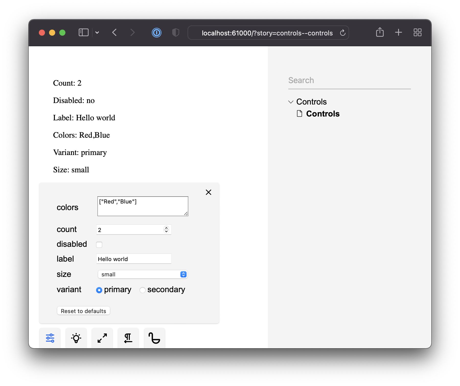
Stories can be parametrized. You can define the props that your component expects and then update them through the UI without changing the code or creating multiple additional stories with the same component. The example below covers all basic args and argTypes that GingerBook supports:
import type { Story } from "@ginger-society/ginger-book";

export const Controls: Story<{
  label: string;
  disabled: boolean;
  count: number;
  range: number;
  colors: string[];
  variant: string;
  size: string;
  airports: string[];
}> = ({ count, range, disabled, label, colors, variant, size, airports }) => (
  <>
    <p>Count: {count}</p>
    <p>Range: {range}</p>
    <p>Disabled: {disabled ? "yes" : "no"}</p>
    <p>Label: {label}</p>
    <p>Colors: {colors.join(",")}</p>
    <p>Variant: {variant}</p>
    <p>Size: {size}</p>
    <p>Airports: {airports.join(",")}</p>
  </>
);

Controls.args = {
  label: "Hello world",
  disabled: false,
  count: 2,
  colors: ["Red", "Blue"],
};
Controls.argTypes = {
  variant: {
    options: ["primary", "secondary"],
    control: { type: "radio" }, // or type: inline-radio
    defaultValue: "primary",
  },
  size: {
    options: ["small", "medium", "big", "huuuuge"],
    control: { type: "select" }, // or type: multi-select
  },
  airports: {
    name: "International Airports", // custom label
    options: ["sfo", "slc", "prg"],
    // custom option labels
    labels: {
      sfo: "San Francisco",
      slc: "Salt Lake City",
      prg: "Prague",
    },
    control: { type: "check" }, // or type: inline-check
  },
  range: {
    control: { type: "range", min: 1, max: 10, step: 0.5 },
    defaultValue: 5,
  },
};
GingerBook detects args / argTypes and provides the Control UI so you can update the component without touching the code. You can define primitive types through args and enums through argTypes:

You can also create multiple stories by assigning different default args / argTypes to the same component:
import type { Story } from "@ginger-society/ginger-book";

const Card: Story<{
  label: string;
}> = ({ label }) => <p>Label: {label}</p>;

export const CardHello = Card.bind({});
CardHello.args = {
  label: "Hello",
};

export const CardWorld = Card.bind({});
CardWorld.args = {
  label: "World",
};
File level controls
Both args and argTypes can be also set for all stories in a single file:
export default {
  args: {
    label: "Hello world",
  },
  argTypes: {
    cities: {
      options: ["Prague", "NYC"],
      control: { type: "check" },
    },
  },
};
Per-story args / argTypes will override the file level ones.
Global level controls
You can also define global args and argTypes in .ginger-book/components.tsx. These will be applied to all stories in the project:
export const args = {
  label: "Hello world",
};

export const argTypes = {
  cities: {
    options: ["Prague", "NYC"],
    control: { type: "check" },
  },
};
Per-story controls > file level controls > global level controls.